|
|
|
|
|
|
|
A
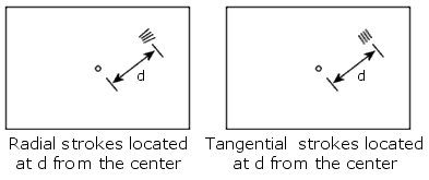
Story About MTF Modulation Transfer Function (MTF) is a very popular tool to measure resolution of optical systems. Unfortunately, it is often misunderstood by both engineers and photographers. People tend to rely on mathematics and forget about general physical principles. Of course, MTF charts can explain many interesting things. But they cannot explain everything. This article gives some physical interpretations of MTF without paying a lot of attention to technical details. Its purpose is to teach you how to treat MTF curves and how to derive truly valuable information from them. What kind of function is MTF? Suppose you drew several black and white lines on a piece of paper and took a picture of them, what would you see? On your photograph, the black lines will become lighter, while the white lines will become darker. In other words, the contrast will decrease. In different parts of the image, the contrast will drop to a different degree. An MTF curve shows to what extent the contrast drops at any particular distance from the image center.
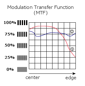
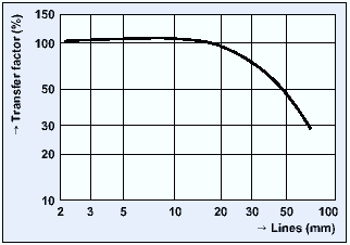
When the contrast drops below the resolution level, we will not be able to distinguish black and white strokes in the image. Everything will be equally gray. It would take too many words to discuss the resolution level here. Another boring article could be written on this issue. To keep things simple, just believe this level is somewhere between 10 and 50 per cent. Generally speaking, the decrease in contrast causes the decrease in sharpness. Thus, MTF curves show how sharp are images produced by lenses. Now let us consider a simplified example. The picture below shows two MTF curves for two different lenses. Let us assume the curves were obtained under the following conditions:
Which one is better? There is no simple answer to this question.
Sometimes, integral values are used to grade lenses. And many people do believe that a lens with 3.9 points is better than a lens with 3.6 points. I believe, such an approach is crazy! MTF curves provide us with a lot of information that cannot be reduced to one value. Let us get back to our example. Imagine we introduced the following quality criterion: the bigger the area under the MTF curve, the better. In our example the area under the red curve is larger by 6 to 7 per cent. We can give 4.9 points to Lens#1 and 4.6 points to Lens#2. Does this make sense? I do not think so. As I have shown above, we cannot say Lens#1 is undoubtedly better. Of course, the difference in 2 points would tell us something, but only spurious statements can be made based on the 6% difference. Moreover, I could easily redraw the curves, making only minor changes in their shapes and leaving slightly larger area under the blue curve. Will "Photographer A" change his mind in that case? Of course, he will not. The integral values at the Photodo website absorb considerably larger information, taking readers away from physics to statistics. But calculators are a poor substitution for both the common sense and physical understanding. Market prices for lenses can be much better indicators, I believe. Thus, MTF curves can be very informative. But it is important to understand that they cannot represent the entire idea of lens quality. They cannot tell us everything even about sharpness.
I can easily continue asking questions. But the idea is simple. There are no perfect instruments. There are no perfect methods. There will always remain unclear questions.
MTF curves are a very useful instrument. The more we understand this, the more reasons we have to learn how to use them correctly.
Links 1.
If you are looking for a mathematically rigorous deduction and more details,
please read 2.
A lot of real MTF curves for many available lenses can be found at
|
|
|
|
|
® Igor Yefremov, 2002, all rights reserved You
must obtain a written permission from me to use any materials of this
site for any commercial or non-commercial purposes, unless there is an
explicit statement to the contrary. |
|